BACKGROUND
Doroub, meaning Paths in Arabic, is a logistics company with a vision to revolutionize the sector by offering streamlined services and, eventually, expanding into courier solutions. The brand needed a strong identity that reflected its focus on strategic planning, innovation, and the journey it facilitates for businesses and individuals.
The challenge was to craft a logo and brand identity that could capture the company's ambitions while maintaining simplicity and adaptability. Doroub’s essence lies in creating efficient pathways, and the branding needed to embody that core philosophy visually.
MY ROLE
I designed the entire brand identity and took on the art direction to ensure that every element reflected Doroub’s strategic vision. My contributions included:
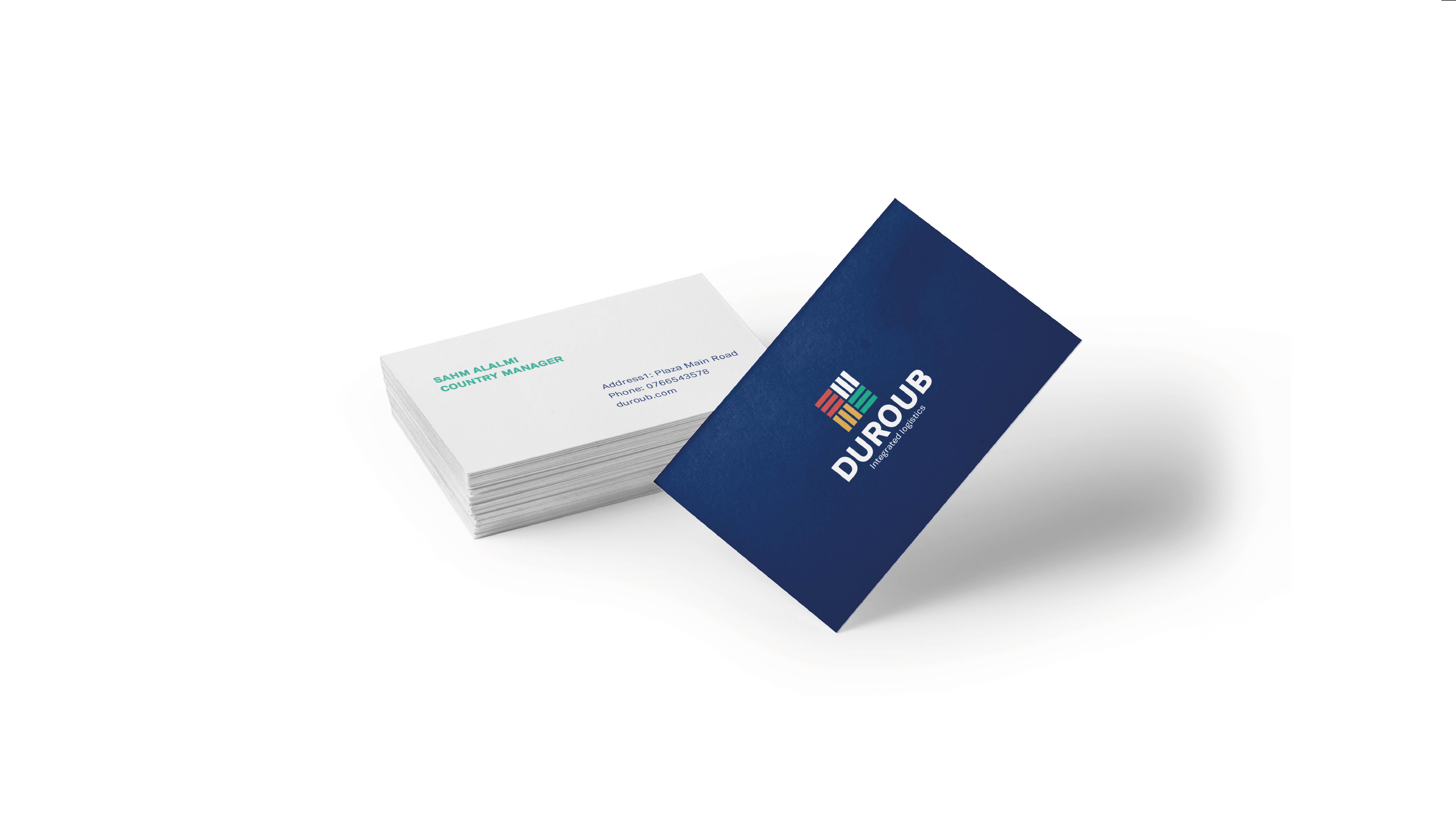
- Logo Design: I designed the logo to represent the company's core values. By integrating a box, symbolizing logistics and packages, with a path, it visually narrates Doroub’s strategic and long-term vision. The result was a logo that is both functional and symbolic, emphasizing the company's focus on movement, connectivity, and progress.
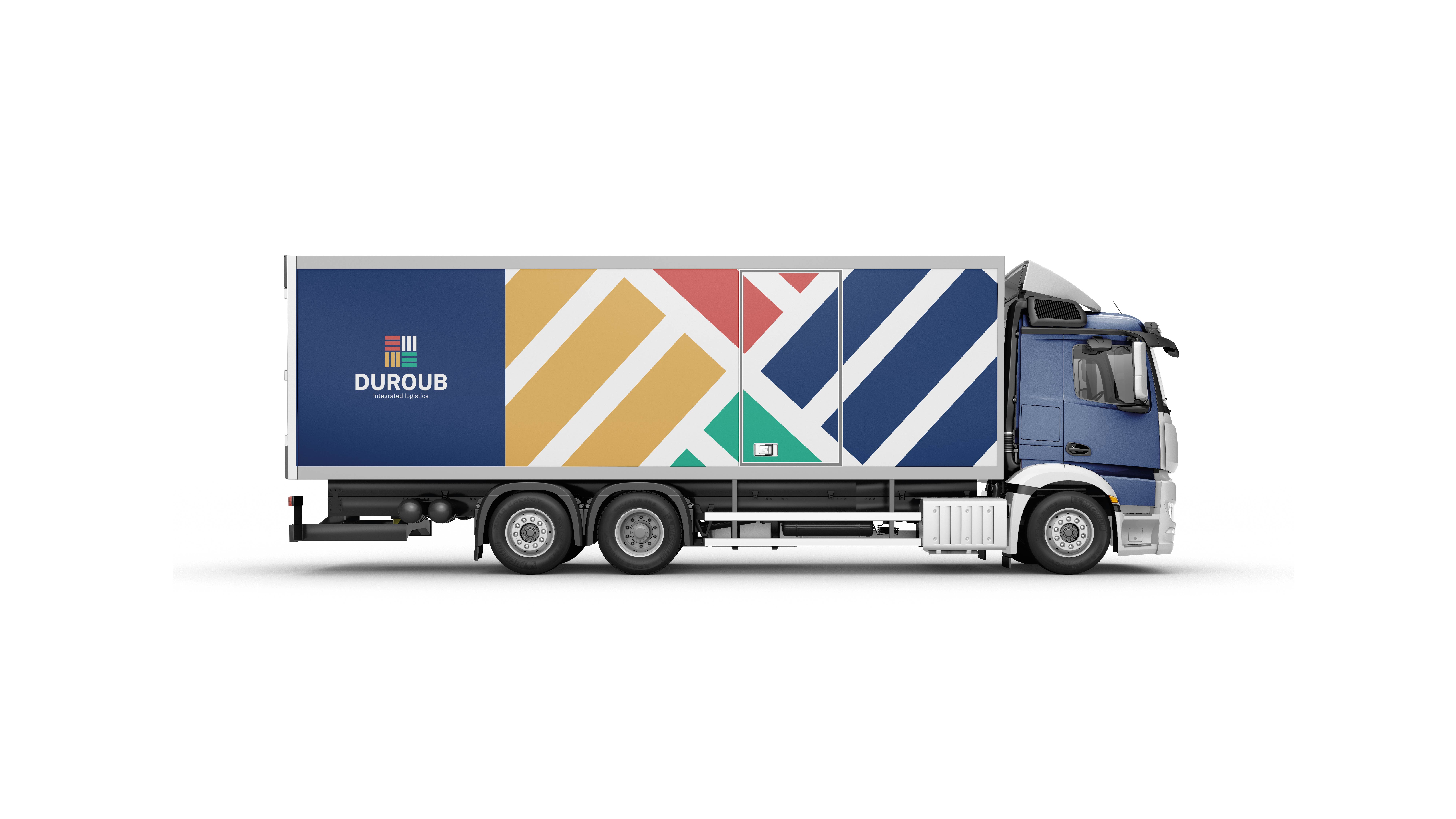
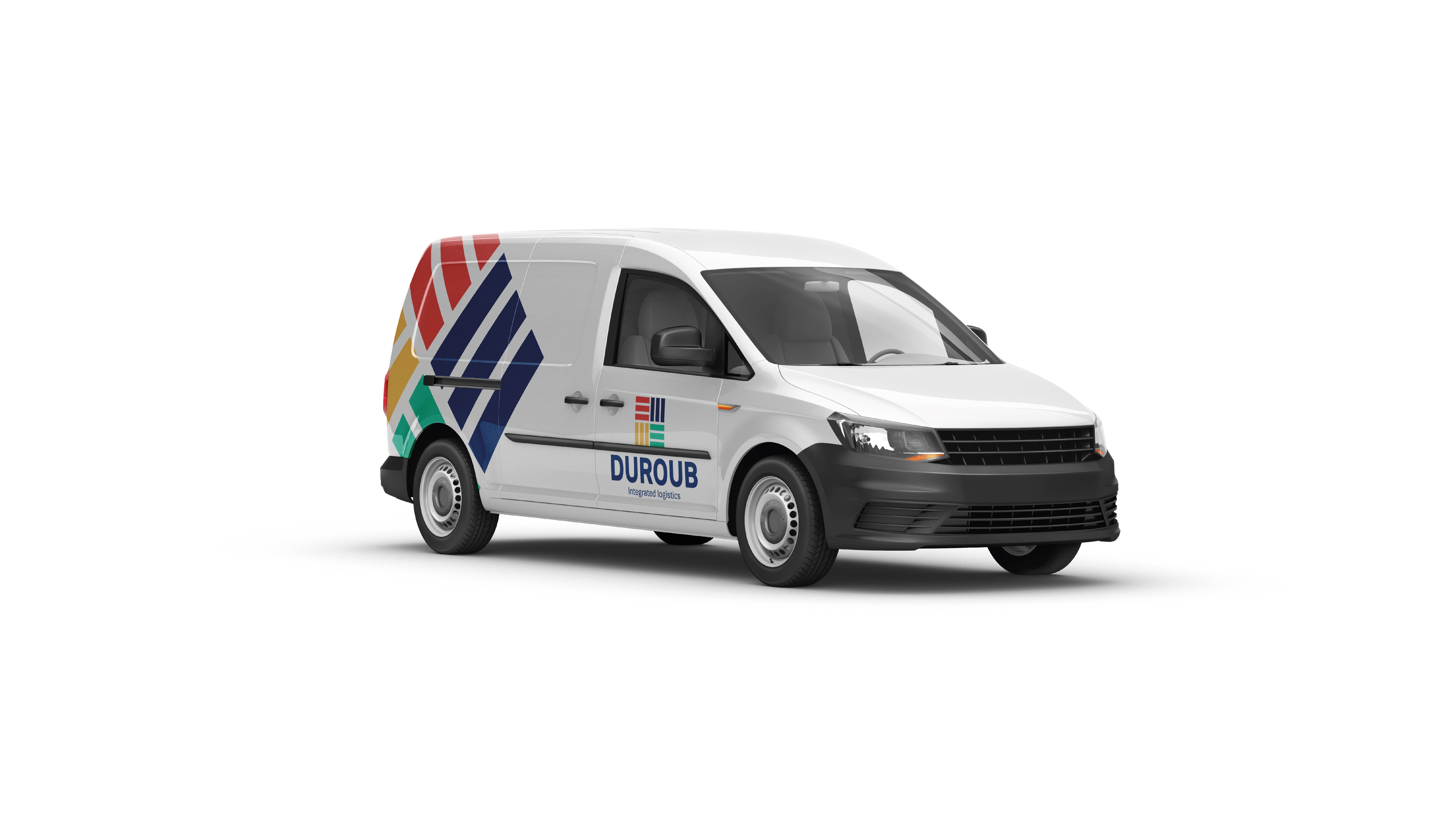
- Supergraphic Creation: I developed a dynamic supergraphic derived from the path motif within the logo. This visual element allowed the brand to stretch across a variety of applications, creating a consistent yet versatile identity. The supergraphic became a cornerstone of the brand, adding energy and cohesion to marketing materials and other touchpoints.
- Color Palette and Visual Identity:I curated a modern and professional color palette, balancing bold and neutral tones. The chosen colors convey trust, efficiency, and innovation while reflecting the identity of the region. I ensured the visual identity was adaptable, scalable, and consistent across all mediums.


