EXPO SAUDI: DESIGNING A LANDMARK IDENTITY
Expo Saudi was a monumental project, representing a multi-thousand-dollar investment and one of the agency's largest-scale branding initiatives. Recognizing the significance of this endeavor, the entire agency came together for collaborative brainstorming sessions, exploring countless ideas to ensure the final logo and identity truly reflected the grandeur and vision of Saudi Arabia.
FROM BRAINSTORM TO BREAKTHROUGH
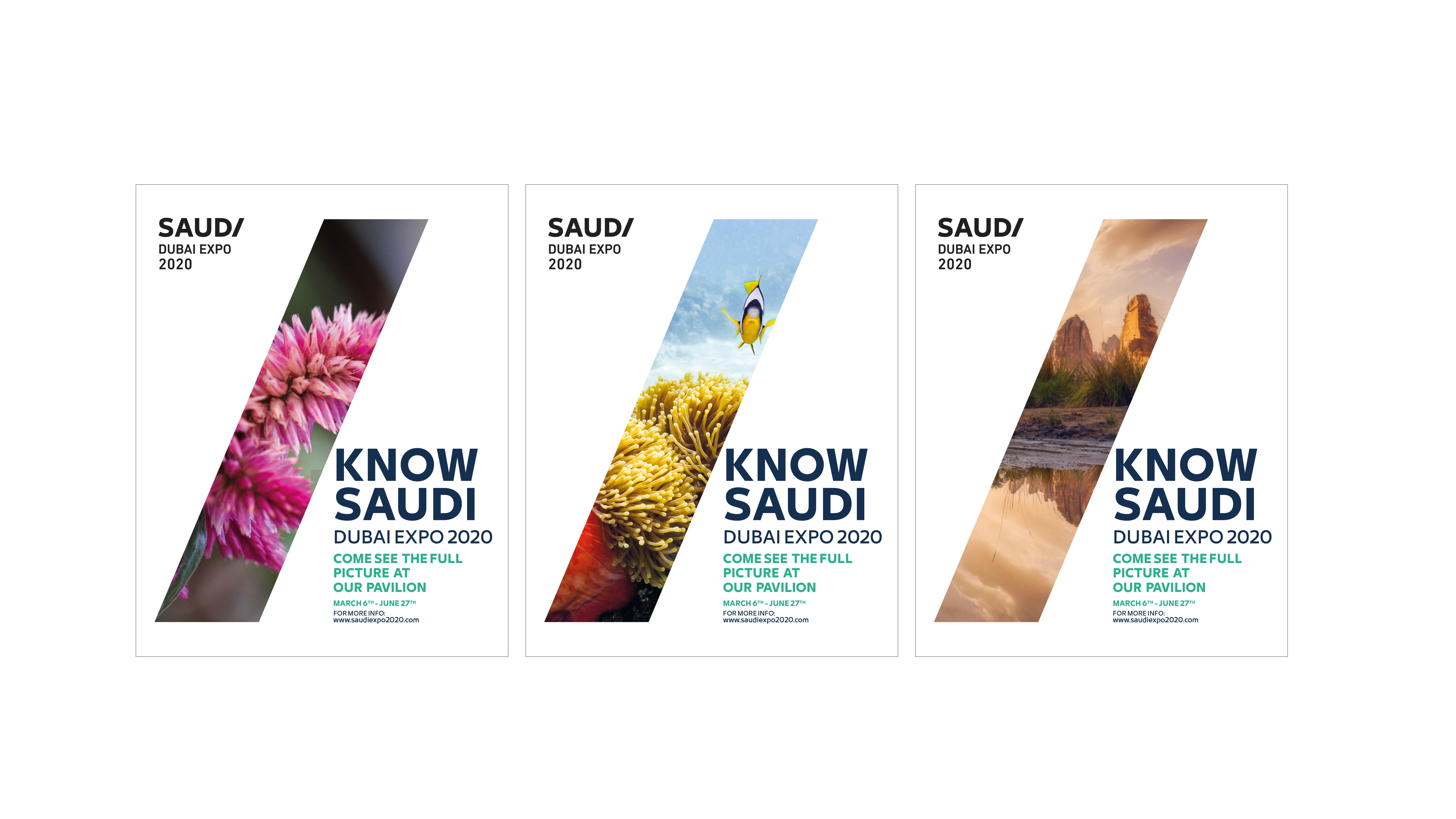
I led the design process by channeling insights from these collaborative sessions to create a logo deeply rooted in the essence of Saudi Arabia and the Expo’s purpose. The design drew inspiration from the polygonal architecture of the Expo structure. To ensure the logo’s adaptability and longevity, I also developed a versatile supergraphic—an extension of the logo that shaped the art direction for all brand visuals, giving the identity a dynamic yet cohesive framework.
COLORS THAT SPEAK ELEGANCE AND HERITAGE
The color palette was carefully chosen to reflect the identity of Saudi Arabia, balancing simplicity with elegance. I integrated hues inspired by the nation's heritage—rich greens, earthy tones, and gold accents—creating a modern yet timeless aesthetic that mirrors Saudi’s cultural and economic aspirations on the global stage.
A UNIFYING SYMBOL FOR A GLOBAL EVENT
This project wasn’t just about designing a logo; it was about crafting a brand identity that would stand as a beacon for Saudi Arabia’s innovation and progress. By leading the visual identity design and extending it across applications, I contributed to establishing a powerful and cohesive narrative for Expo Saudi—a project that united the agency and demonstrated the power of creative collaboration.


