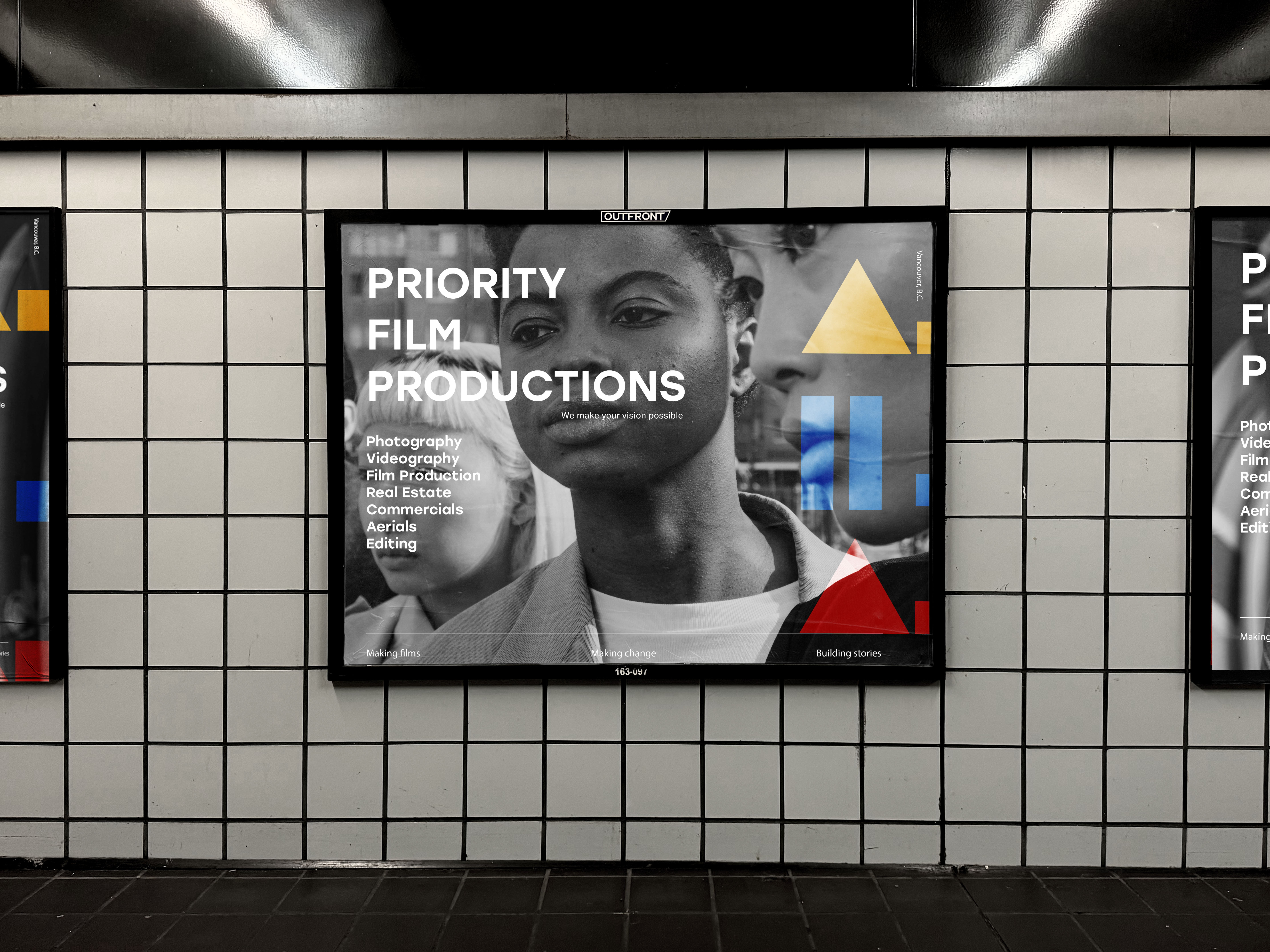
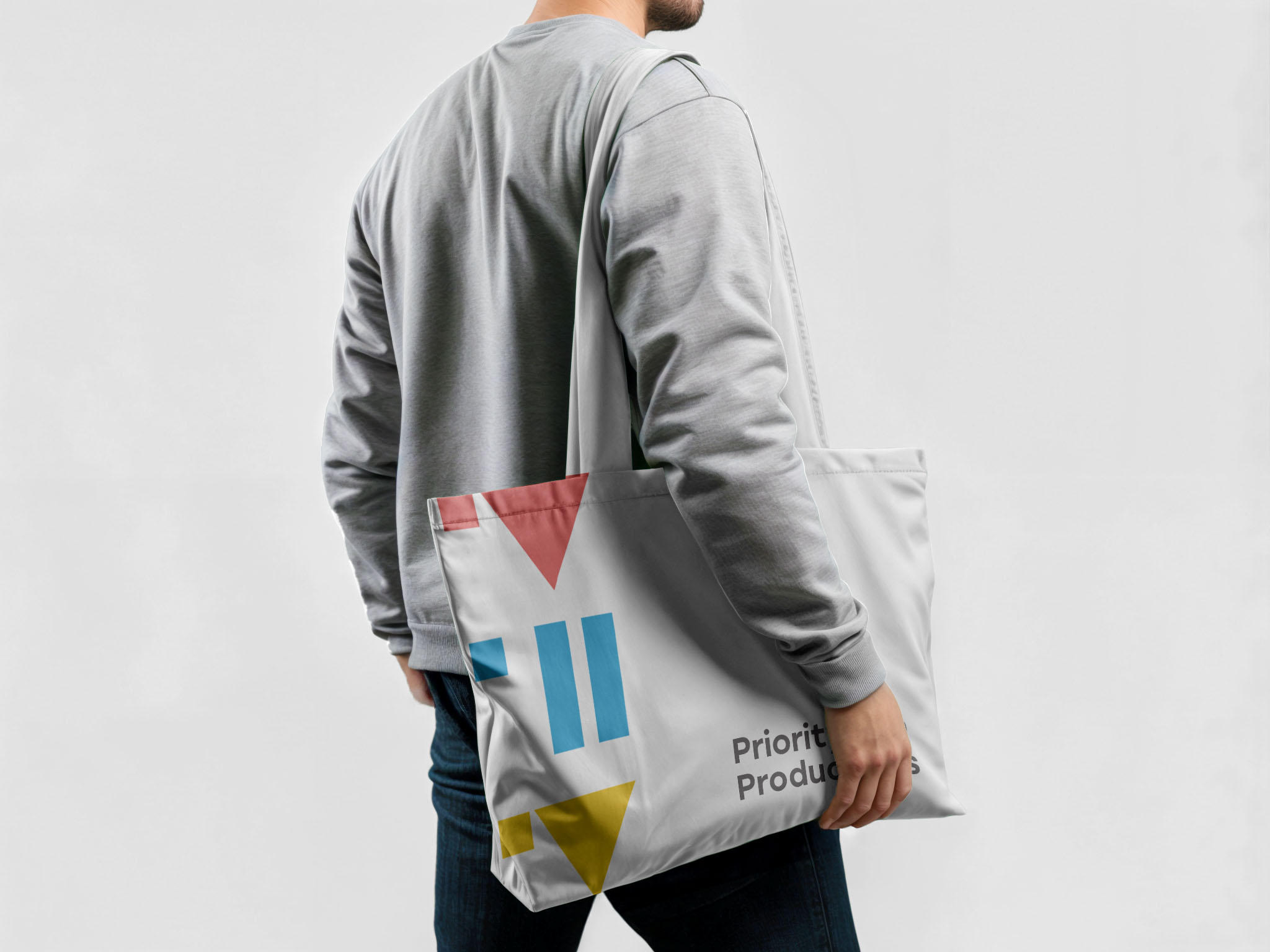
The concept for Priority Film Production’s (PFP) brand identity stems from an innovative approach that seamlessly combines its initials with visual symbols of “play” and “pause,” making the logo a central feature that reflects both functionality and personality. To bring the brand to life, this branding strategy integrates a playful yet purposeful design that permeates every touchpoint of PFP’s identity, combining a nostalgic nod to traditional film with a vibrant, modern twist. This approach will reach across digital and physical experiences, ensuring PFP’s brand is both memorable and engaging for creators and audiences alike.
My role in this project:
In this project, I was responsible for overseeing the entire creative process from concept to execution. I led all client meetings to ensure a clear understanding of their vision and goals for the rebranding, establishing a collaborative environment where ideas could flow freely. My role involved everything from initial brainstorming and sketching concepts to refining these ideas based on client feedback. I kept close alignment with the client’s vision, meticulously incorporating their input at every stage and making necessary adjustments to ensure the final output perfectly captured their brand identity. This hands-on approach allowed me to maintain a cohesive aesthetic and seamless communication, ultimately delivering a result that met—and exceeded—their expectations.

The PFP logo is designed to captivate users at first glance,
By integrating the initials "PFP" with play and pause symbols, the logo not only symbolizes the film industry but also communicates a sense of movement and creativity. The use of cyan, magenta, yellow, and black—a nod to traditional printing colors—adds a modern, dynamic feel that’s eye-catching across both digital and print formats.
By integrating the initials "PFP" with play and pause symbols, the logo not only symbolizes the film industry but also communicates a sense of movement and creativity. The use of cyan, magenta, yellow, and black—a nod to traditional printing colors—adds a modern, dynamic feel that’s eye-catching across both digital and print formats.